Colours and Fonts for Branding
There are multiple factors that contribute to choosing the right colour for your brand such as emotional response, colour popularity, industry standards and combinations. Your brand identity not only sets you apart from other brands but also displays the services and products you are providing as well as showcases what your brand is about.
What emotion do you want from your audience? How do you want them to react to your brand colour(s)? The colour you choose for your brand’s identity will help communicate your company’s message better so it is important to consider the right colours.

Pink
Romance, Femininity, Love, Physical Tranquility.

Red
Love, Warmth, Energy, Romance, Comfort, Gentleness.

Orange
Excitement, Change, Playfulness, Prosperity.

Yellow
Friendly, Cheerful, Happiness, Positivity, Youthful.

Green
Nature, Fertility, Harmony, Tranquility, Health.

Blue
Wisdom, Loyalty, Mystery, Respectability, Sophistication.

Purple
High Quality, Authenticity, Introspection, Truthfulness.

Black
Luxury, Modern, Glamour, Power, Strength, Intelligence.

When choosing the right font for your brand it is best to not pass the three mark – one for your heading, one for sub-headings, and one for body copy. Having more than three fonts will risk your brand appearing haphazardly along with being difficult to incorporate into content marketing. Less than two fonts will make it hard to distinguish headings from body copy.
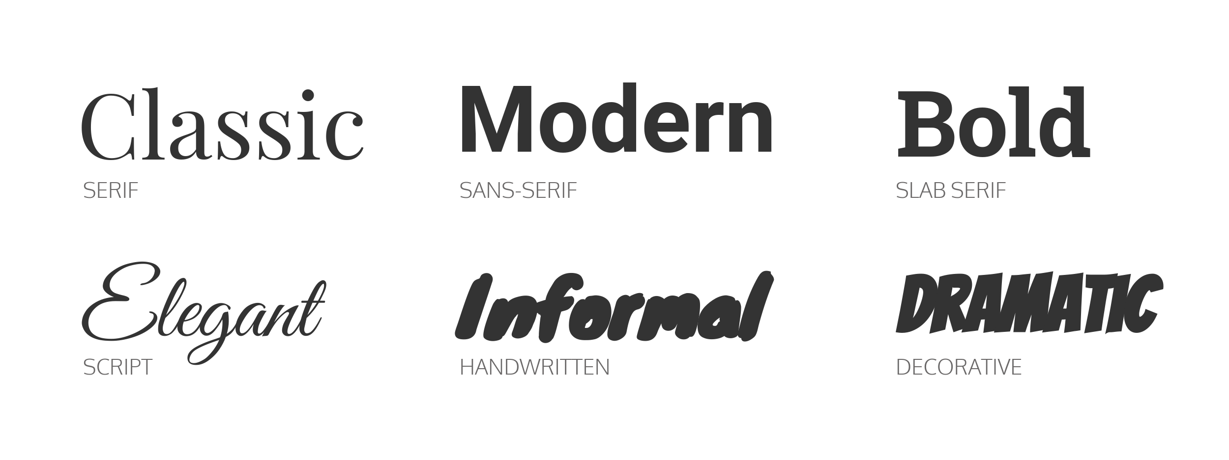
There are six basic font categories;
Decorative
Showcases the brand’s originality and fun personality. Disney, Lego, and Toys R’ Us use this decorative font.
Handwritten
This font helps the brand appear more approachable and playful. Not many brands use this font, Kellogg’s is one brand that uses this font.
Script
Mostly used to showcase creativity and elegance. Coca-Cola, Cadillac, and Instagram use this font.
Sans Serif
Creates a clean, modern look. Google, Facebook, and Calvin Klein use this font.
Serif
For a more traditional appeal, a serif font would be used. Brands that use this font would be Time Magazine, Tiffany & Co, and Abercrombie & Fitch.
Slab Serif
Companies that want to make a bold statement and exude confidence use slab serif fonts. Honda, Sony, and Volvo are some examples.

