AIB – A digital first strategy.
Banks are known to be strongholds of traditionalism and are very conscious about changing their symbolic identity so we were thrilled when appointed to refresh and modernize the AIB brand. Previous to this brand refresh, the AIB logo was last updated 26 years previous, a vertical design that did not lend itself well to digital formats such as mobile and web.
Our creative solution for the new logo was to choose a colour that was welcoming, sociable and attainable. The colour purple embodies the balance of red’s stimulation and blue’s calm, uplifting a viewer while encouraging creativity. The graded, angled shadows and direction of the brand symbol seems to evoke a bright and positive future.
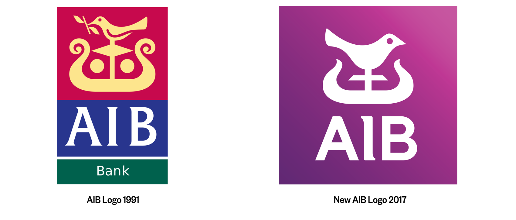
We deconstructed the logo to create a streamlined and flexible brand identity.
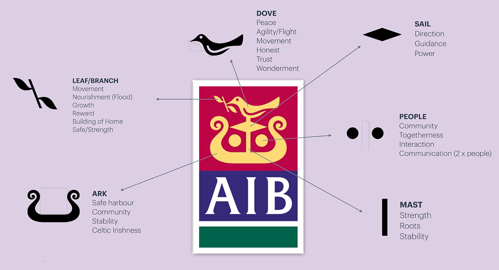
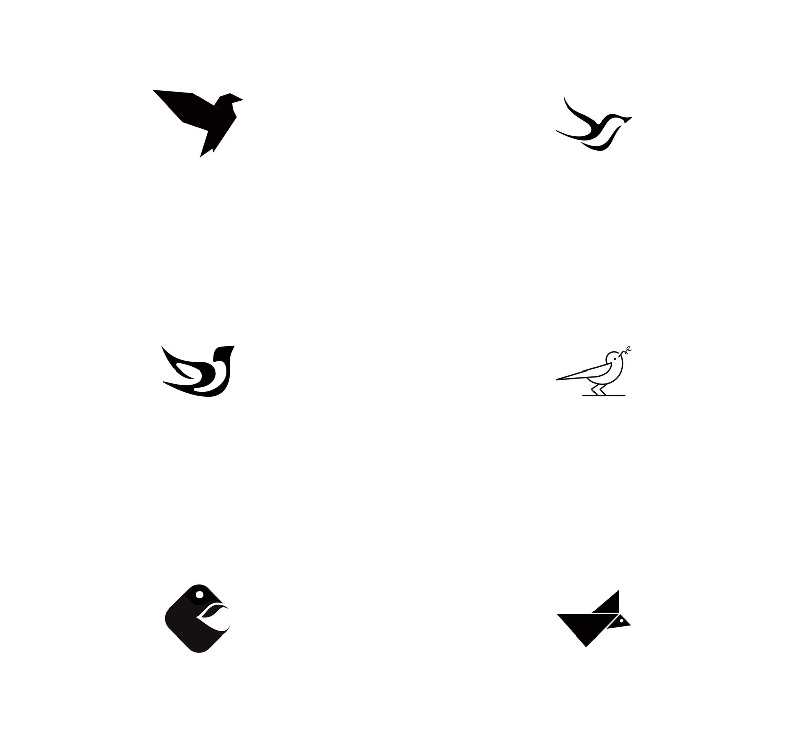
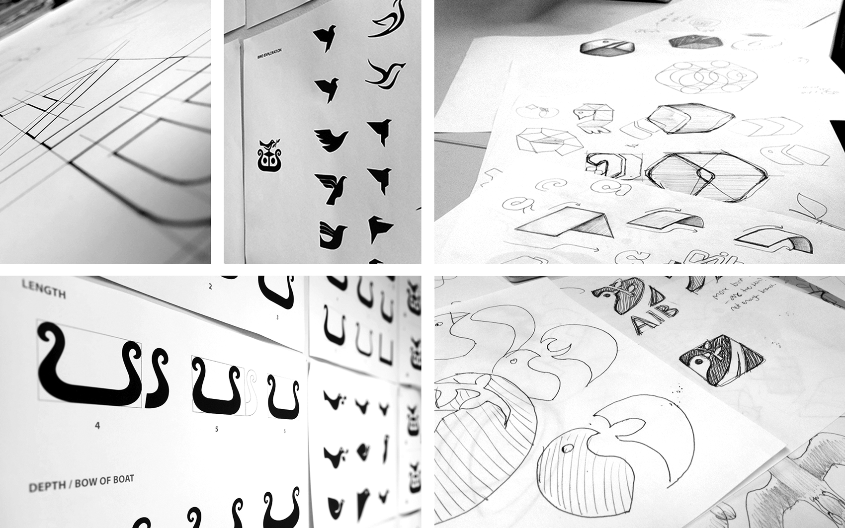
During our creative process, we went through thousands of versions of the ‘AIB Bird’ with the goal of simplifying the symbol while keeping the brand recognition.
Brand Mark Strategy:
- Dove facing forward
- Brand mark is decluttered
- Reuse visual elements increases recognition
- Increase internal space for more transparency, cleaner
- Reduce Celtic cues
- Simplify leaves
- Dove is bigger and leans forward
- Eye drawn left to right
