The Good & The Bad of UX Design
UX is short for User Experience. Not to be confused with UI, UX focuses on how users interact with digital products or services. The main aim of UX is to solve problems and help users accomplish their goals easily and intuitively.
The Good
There are plenty of great examples of UX design out there. Check out some of our personal favourites below.
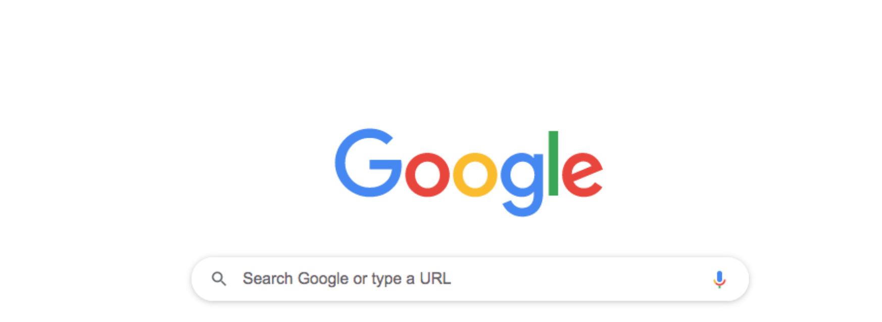
Google’s simplistic design leaves no room for questions on what service it offers. It does exactly what it says on the tin.

Zalando
Zalando, a popular fashion app, has divided key information into digestible chunks through categories and subcategories. This is an implementation of a popular theory called “Hick’s Law” which states the more choices you present your users with, the longer it will take them to reach a decision.
In Zalando’s case, the use of categories and subcategories means the user is less likely to feel overwhelmed when on the app and more likely to complete a desired action such as add an item to their favourites or purchase an item.
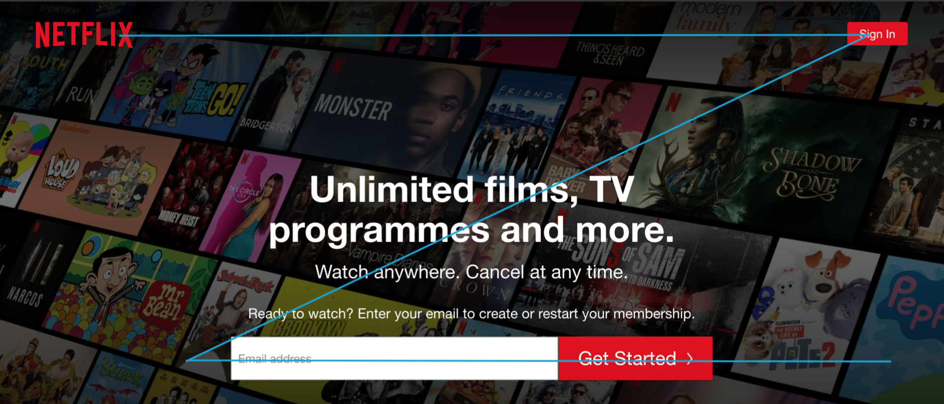
Netflix
On their website homepage, Netflix uses the “Z-shape” pattern to place important information and calls to action.
First, a user will look at the top left where Netflix has placed their logo. The user will then shift their gaze to the top right where Netflix has placed their sign in button. After this, the user is likely to move diagonally down then look across the centre of the screen where the important sign up form is along with other key information about Netflix and the service it offers.
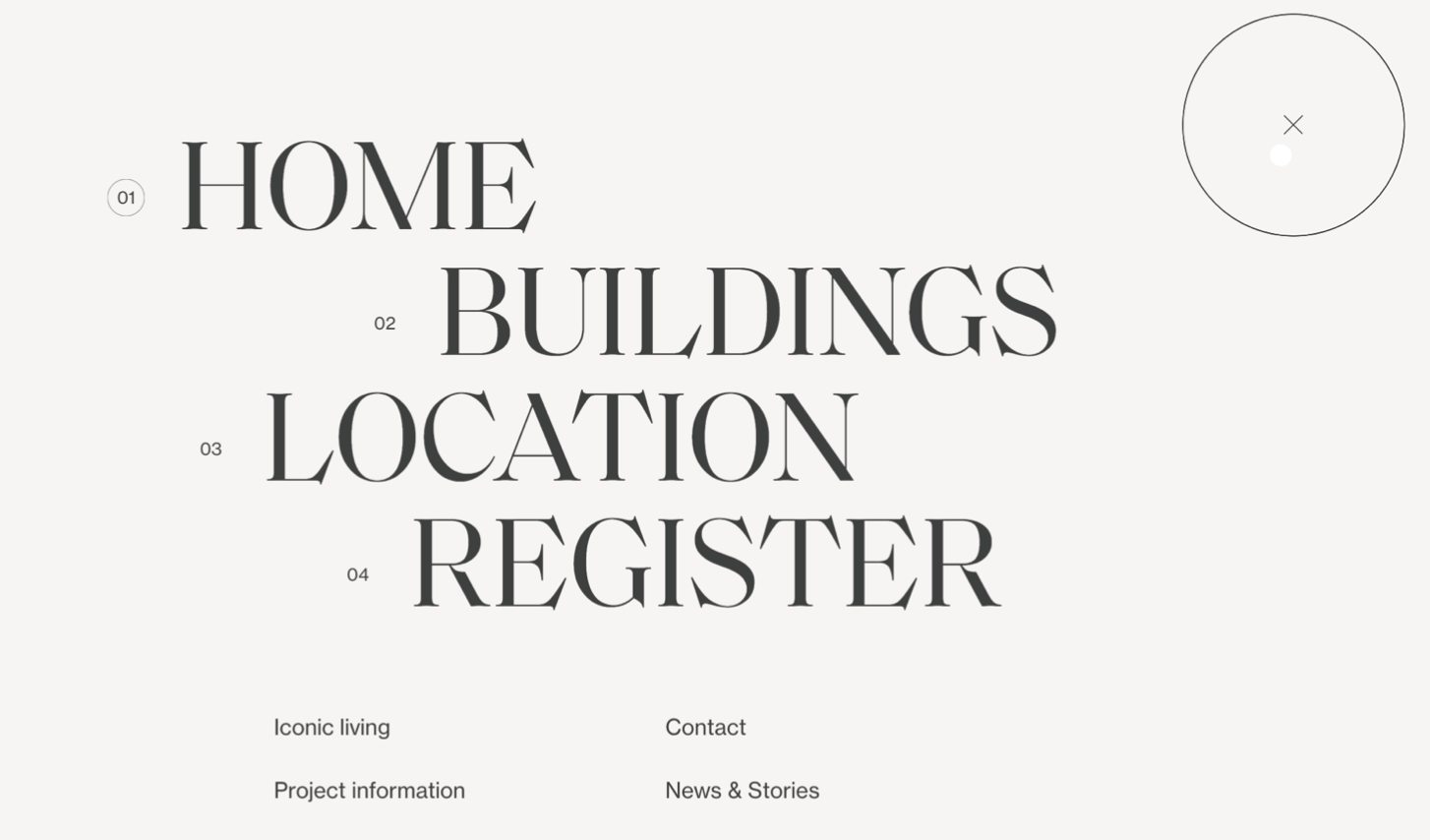
Niuewbergen
We love this example of how user research can lead to defining and creating clear website menu items! It appears Niuewbergen have conducted user research to determine what users would be looking for on their website. They have then condensed these insights down into a menu that isn’t overpopulated with options and is easy to navigate. This is another example of the use of Hick’s Law.

Instagram is the perfect example of UX design particularly for its use of screen reach. As shown in the image below, Instagram have placed the majority of their main interaction features such as like, comment and send within the “Easy” reach area. Their other features such as the post photo and save are placed within the “Ok” reach area.
The Bad
Simply put, bad UX design is counter intuitive. Some companies also use Dark UX design to purposely mislead, trick or confuse users. Check out some of our favourite (or not so favourite) examples of bad UX design below.
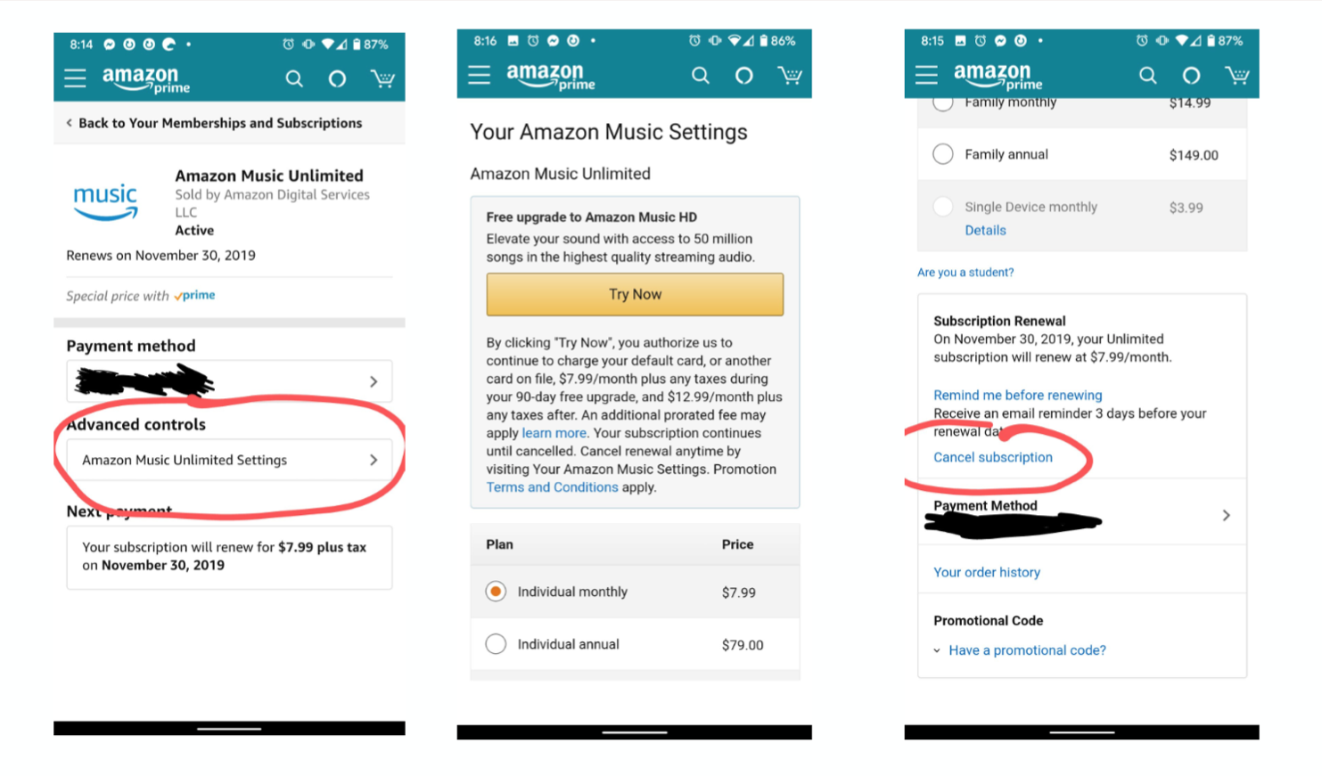
Amazon
Despite being one of the world’s leading companies, Amazon is guilty of using dark UX design to distract users from completing a task the company does not want them to do. In the image below, a user is trying to cancel their Amazon Music subscription. This is obviously something Amazon don’t want a user to do so they have purposely made it long, difficult and distracting for the user.
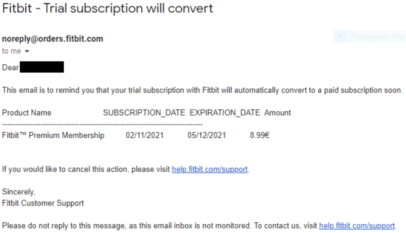
FitBit
Fitbit has also made it difficult for a user to cancel their subscription. Not cool guys, not cool!